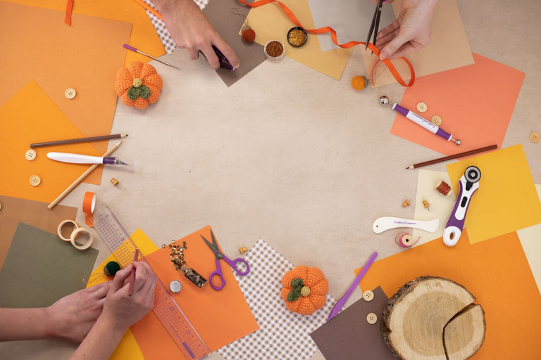
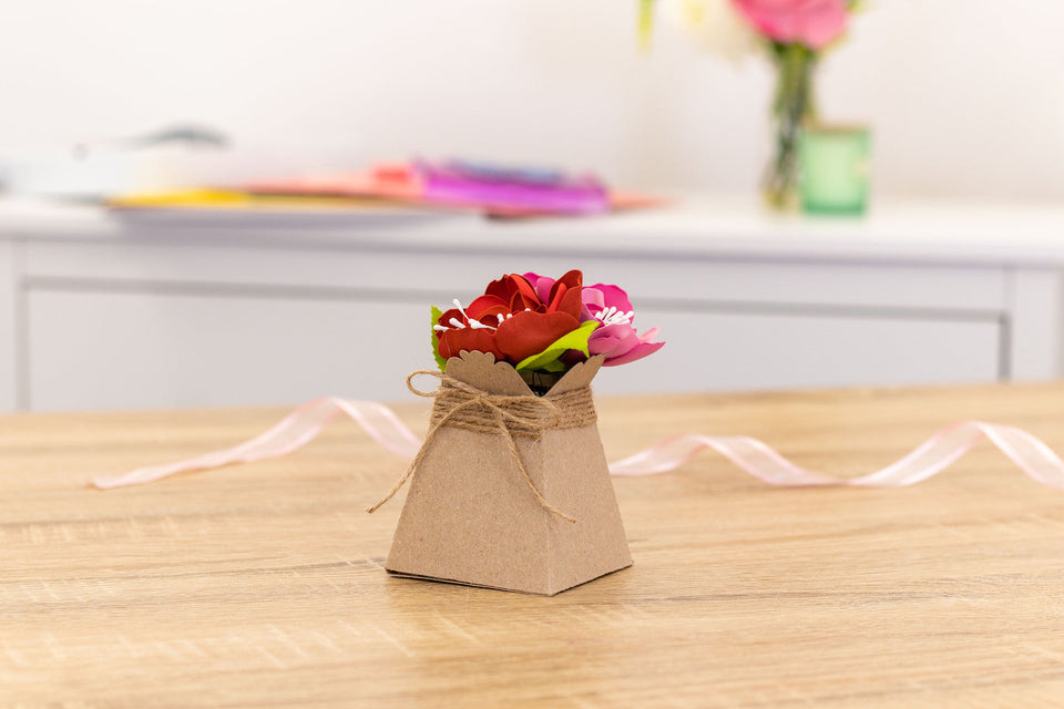
Masterful Mandalas
Step by Step Guide
Learn how to create realistic, three-dimensional designs with this in-depth tutorial from the Mandala Master, Baz Furnell.
Here’s Baz to tell you more:
Hi!
With this guide I will take you through a step-by-step process to turn my lined mandala templates into bold, colourful 3D designs using Spectrum Noir TriBlend markers.
Once you understand the light source, the only limit is your imagination. So, before getting into the step-by-step guide, I think it’s important to explain some basic principles about lighting. By understanding an imaginary light source and the effect that it has on your design, you can make anything you wish appear three dimensional.
Lighting:
In this diagram you can see I have imitated a light source in the form of a torch shining onto the mandala from the 12 o’clock position:
If you can imagine the bright light shining from the torch onto the side of the mandala that is solid and three dimensional, it will have an impact on how the mandala looks. The following principles will help you with turning any 2D object into an 3D one:
- Any surface facing directly towards the light will be highlighted & these areas should either be shaded with very light colours or left unshaded.
- Conversely, any part of the mandala that is raised will create darker shadows facing away from the light source. These should be shaded with darker tones.
- Areas that you wish to appear completely flat should be coloured in a single tone of your choosing & the tone should not change regardless of where the light source is.
- However flat areas that are angled (i.e. facing towards or away from the light) should be shaded according to the direction they are facing. Angled towards the light should be kept light or unshaded and those facing away should be darker.
- Any surface that you wish to appear curved or rounded should be blended. Starting with the lighter tones that are facing towards the light & gradually blending to darker tones as the surface curves or bends away from the light.


Lining and Shading:
Before getting into the step-by-step guide, I wanted to show the variations that can be achieved by lining & shading different areas on the templates.
In the following three diagrams, you can see four identical templates. Even though I’ve followed the principles, you can see once I’ve added line work in certain areas with the art liners and or shaded them in different ways, they can end up looking quite different from each other


In this step-by-step guide I will show you exactly how to turn one of the templates into a 3D blended mandala.
However, I think it’s important to point out that there is no right or wrong way to shade your mandalas. The main aim is to have fun & try different techniques to create your own unique 3D design. My biggest advice to anyone having a go at shading the mandalas is to take your time and enjoy the process!
Step 1.
In this stage you’ll be using two ArtLiner pens to trace the lines on the template. By using the 0.1 ArtLiner on the lines that are facing towards the light and creating thicker lines with 0.3 ArtLiner that are facing away from the light, you can already start to see some depth appearing in the design.
Top tip: Rather than just sticking to the width of the 0.3 ArtLiner, don’t be afraid to add width to the thicker lines by building them up. You can also use the ArtLiners to add your own unique details to the mandala.


Step 2.
This could be called the colouring stage. In stage two we are colouring all the areas that we wish to appear flat. These are the areas of the design that are neither facing towards or away from the light and therefore less affected by it.
Top tip: When shading these flat areas, try to use the darker tones for the flat areas that you wish to appear deeper within the design. This adds to the realism as these areas would naturally be getting less light.


Step 3.
In this stage we will again be using solid colours for the areas that we wish to appear at an angle. In order to make them appeared angled we need to shade them according to whether we think they are facing towards the light or away from it. Those parts that are facing towards the light will either be shaded with the lightest tones of left unshaded. The areas that are angled away from the light will appear much darker.
Top Tip: Tri-Blend markers have three distinct tones, however by building up layers of the same tone you can increase the depth and darkness of each. This gives you much more than just three tones per pen.


Step 4.
This is the blending stage and where we really start to bring the mandala to life. Start with the lightest tones that are facing towards the light. Gradually work away from the light by building layers and adding darker tones. This gives the appearance that a surface is rounded or curved.
Top Tip: When creating a highlight effect, I often leave the area I wish to appear brightest completely unshaded with the whiteness of the paper showing through. I then build the from light to dark moving outwards from this area.


Step 5.
You should already have a mandala that appears pretty three dimensional. However, this is the most important stage for really adding that final bit of depth. By using the darker tones in the areas that are facing directly away from the light we can create shadows which will really make the design pop.
Top Tip: When creating shadows I work in the opposite way to when I want to create highlights. I use the darkest tones directly beneath where I created bold lines with the thicker ArtLiner. I then use the mid and then light tones to gradually blend from dark to light by working away from the light source

